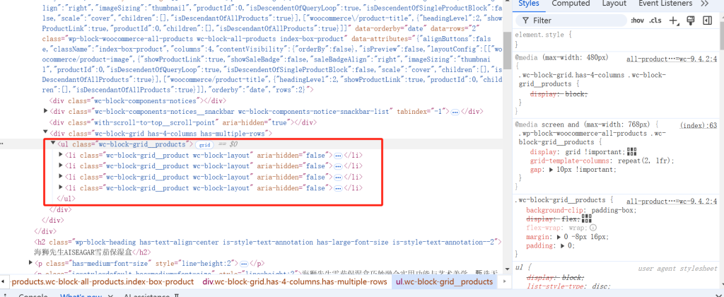
woocommerce控制产品展示的代码为UL和LI标签,在右侧可看到该区域的css优先级别
使用Gird代替Flex工作,因为我尝试Flex多次没有成功
首页查询区块最终代码如下:
@media screen and (max-width: 768px) {
    .wp-block-woocommerce-all-products .wc-block-grid__products {
        display: grid !important; /* 使用 Grid 布局 */
        grid-template-columns: repeat(2, 1fr); /* 每行 2 列 */
        gap: 10px !important; /* 设置产品间距 */
    }

    .wp-block-woocommerce-all-products .wc-block-grid__product {
        box-sizing: border-box !important; /* 确保宽度计算正确 */
    }

    .wp-block-woocommerce-all-products .wc-block-grid__product a {
        display: block !important; /* 确保链接区域是块级元素 */
    }
}
商店归档页代码如下
@media screen and (max-width: 768px) {
    .wc-block-product-template {
        display: grid !important; /* 使用 Grid 布局 */
        grid-template-columns: repeat(2, 1fr); /* 每行 2 列 */
        gap: 10px !important; /* 设置产品间距 */
    }

    .wc-block-product-template .wc-block-product {
        box-sizing: border-box !important; /* 确保宽度计算正确 */
        padding: 5px; /* 增加内边距 */
    }

    .wc-block-product-template .wc-block-product a {
        display: block !important; /* 确保链接区域是块级元素 */
        text-align: center; /* 居中对齐 */
    }

    .wc-block-product-template .wc-block-product img {
        max-width: 100%; /* 确保图片宽度适应容器 */
        height: auto; /* 保持图片比例 */
    }

    .wc-block-product-template .wp-block-post-title {
        font-size: 1rem; /* 调整标题字体大小 */
        margin-top: 5px; /* 增加标题的顶部间距 */
        text-align: center; /* 标题居中 */
    }
}
发表回复
要发表评论,您必须先登录。